Chart analysis
Chart analysis, technical analysis or chart technique. There are many names that describe one and the same, namely the analysis of stock market prices and prediction of future price developments. The goal of the chart analysis is to optimize the profit in trading and investing and to reduce the risk.
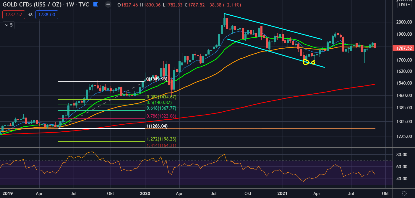
Table of contents
What is chart analysis?
Chart analysis, or technical analysis and charting, is the study of charts to predict potential price movements. Chart analysis uses trends, formations and indicators to evaluate the probabilities of rising or falling prices.
Chart analysis is the prediction of future price trends based on their past.
Is chart analysis useful?
It is useful to use chart analysis for your own trading and investing. The profit can be increased by the correct application of the chart analysis. At the same time, the loss can be reduced by chart analysis and a clear trading strategy can be formed.
Chart analysis is considered humbug by many small investors and many have doubts about the usefulness of technical analysis. What at first glance is just a confused drawing of lines on the chart, is on closer inspection a helpful tool for trading or investing.
It can be said that chart analysis is a science in itself. There are methods and rules how to analyze the charts. The choice of indicators and tools is very wide. Many chart analysts develop their own strategy or style over time.
Although the selection of analytical tools and indicators for chart analysis is very large, the success lies rather in the simplicity. Many successful chart analysts and traders often use only a handful of tools, such as trendlines, RSI or Fibonacci.
How reliable is chart analysis?
There is no such thing as 100% accuracy in chart analysis. Especially in times of high volatility or illiquid markets (such as penny stocks) the chart technique sometimes fails. On the other hand, chart analysis is very effective in large markets, such as the currency markets or even indices.
The time frame also plays a role in chart analysis. The larger the time period considered (daily, weekly or monthly chart), the more reliable the chart analysis. With smaller time windows, such as hourly charts, the accuracy of the chart analysis may decrease. With larger time windows, such as the weekly chart, the chart analysis is very reliable.
It must be clear to everyone that chart analysis is not a guarantee of success. However, properly applied, it can be of great benefit. The result of a chart analysis is the weighing of the two scenarios, whether the price rises or falls. Using chart formations, trends and indicators, the chart analyst gets an overall picture of the chart and evaluates the probabilities of which direction the market could go.
For small investors who are dedicated to trading, chart analysis is a very interesting tool. It is very reliable in Forex trading. Trading with stocks and indices can also be improved by chart analysis. Success in chart analysis, as with so many things in the stock market, comes through experience. With time, the view of the charts and their analysis improves and trading becomes more lucrative.
When does chart analysis work?
Chart analysis works best in stable market phases with clear trends. With established upward or downward trends, chart formations and indicators usually work like a textbook. Volatility should not be too high for meaningful chart analysis, as this can lead to false signals.
The type of markets also plays an important role in the accuracy of chart analysis. Here is a list of markets where chart analysis works well:
- Forex, especially major like EUR/USD
- Indexes
- Gold, Silver
- Stock market (mainly blue chip stocks; no penny stocks)
In Forex trading, chart analysis is the most widely used. This is because Forex markets are more stable than other markets. Thus, the reliability of chart analysis is better here and can improve the result of trading. Indices are also very suitable for chart analysis because they are broadly diversified markets.
In the commodity market, chart analysis works only with limitations. In gold and silver, chart analysis can give very good results and success. It is also applicable for some industrial metals like platinum or copper. With agricultural commodities or even oil, too many external and unpredictable factors play a role. Also the stock market is divided and in large parts the chart analysis works here very well, as for example with blue chip shares. It works poorly for penny stocks.
When does chart analysis not work?
Chart analysis does not work in times of extreme volatility, such as during a stock market crash or even during exaggerations and hypes. Chart analysis also works with limitations in certain commodity markets and in cryptocurrencies. Unforeseen economic and political events can override chart analysis.
Here is a list of markets where chart analysis does not work:
- Pennystock shares
- Cryptocurrencies (except Bitcoin in the weekly chart)
- Agricultural commodities, oil, natural gas
In the commodity markets, chart analysis is only applicable to a very limited extent. Here, depending on the commodity, a wide variety of influencing factors play a role. Political events and natural disasters can turn the commodity market within seconds. The market for cryptocurrencies is also very susceptible to both good and bad news and events. These can destroy a clear chart picture and a clear chart analysis in a matter of seconds.
What tools and indicators are available?
Trend lines:
Trend lines are a standard tool in chart analysis. The drawing tool is used to connect at least 2 points in the chart. You can tell by trendlines when a trend is still intact and when it is broken. A break of a trend line often means a trend reversal.
Trend lines also serve as support and resistance lines in chart analysis. Thus, it is possible that trend lines are tested several times by a price as support or resistance. Prices often move between two trend lines in a trend channel. A break out of the trend channel is often a strong sign of a major trend reversal.
Moving averages:
Moving averages are used similar to trend lines to visualize trends. The moving average is the averaged price value of the past 14 hours, days or weeks (depending on the time window). There are other types besides the simple moving average. The exponential moving average (EMA) is one of the most popular chart analysis tools and is very reliable during strong trend phases.
Multiple moving averages with different settings are often used. The most common settings and uses for moving averages are the 10, 20, 50 and 200 moving average. Moving averages are also used to define whether we are in a bull market or a bear market.
oscillators (e.g. the RSI):
An oscillator is a leading indicator in chart analysis that swings (oscillates) between two ranges, indicating when the market is oversold or oversold. Oscillators like the RSI work best in sideways phases. In trend phases, oscillators show the extreme ranges oversold or oversold too early, which can lead to misinterpretation.
A very big advantage of oscillators is that they can indicate new trends early. Through so-called bullishce or bearish divergences, they show the direction of future price development even before the start of the new trend. In the case of a bullish divergence, the indicator moves upwards while the price is still moving downwards. In a bearish divergence, the trend is at the end of an upward phase. The price is still moving upwards, but the oscillator already shows weakness and moves downwards.
Here is a list of the most popular oscillators for chart analysis:
- Releative Strength Index (RSI)
- Momentum
- Stochastic RSI
- True Strength Index
- MACD
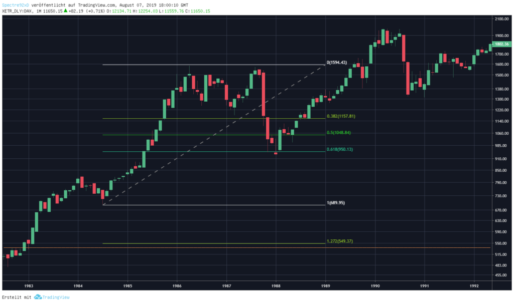
Fibonacci retracement:
The Fibonacci retracement, or Fib retracement, is a very popular chart analysis tool. It is used in trend phases to define price corrections and works very well. The Fibonacci retracement is drawn from the starting point to the ending point of a price movement. The most relevant retracements within this range are the 38.2%, 50% and 61.8% retracement. These 3 ratios serve as a reference point for possible price corrections in the trend.
What is the best free chart analysis tool?
The offer of free chart analysis tools and platforms is very large. With most brokers, rudimentary chart analysis tools are already more or less well integrated into the depot. Those who trade intensively, especially CFD trading, need a larger and better range of chart analysis tools.
One of the largest platforms and communities for chart analysis is TradingView. TradingView offers the possibility to analyze charts for free, share ideas with the community and many other ways to make your trading more efiicient.
Here is a list of advantages of TradingView:
- Free version for chart analysis
- Large community for the exchange of ideas
- Modern and intuitive chart analysis app
- Integrable brokers for direct trading with TradingView charts
- Alarms and push notifications
- Write your own trading algorithms
- Free stock screener
TradingView offers many of its features already in the free version of the chart analysis tool. Those who want to get to know the platform can download a open free TradingView account.